
Autumnal Inspired wedding stationery
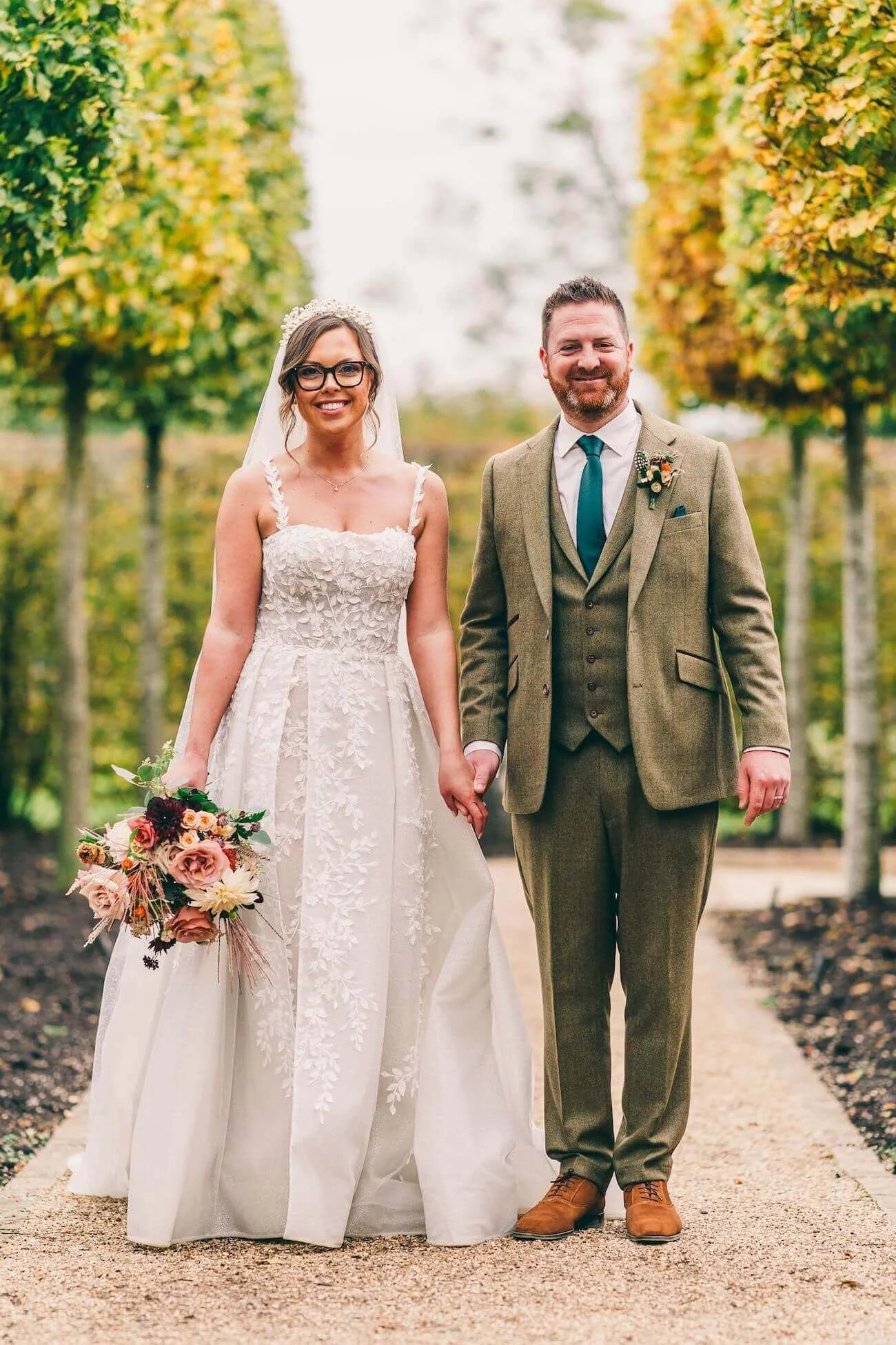
There are weddings that make you fall in love with your job all over again. This one was absolutely one of them.
I had the most wonderful time designing the stationery for a recent October wedding, and I haven't been able to stop thinking about it since. The colours, the flowers, the atmosphere — everything about an autumn celebration lends itself so naturally to beautiful, considered stationery, and this day was the perfect reminder of why I adore working with this season above all others.
October: The Most Generous Month for Colour
If you follow me on Instagram, you'll know I have a serious soft spot for a warm, floral-forward palette — and an October wedding is practically tailor-made for it. The colour story here was all deep berry tones, dusty blush, terracotta, burnt orange and rich burgundy, layered together in the way that only the most confident autumn brides dare to go. And honestly? It was breathtaking.
It's a palette that feels effortlessly luxurious. Not in a formal, stuffy way — but in that warm, romantic, gathered-around-a-candlelit-table way that makes your guests feel instantly at ease. October is so genuinely generous with its colour — the season does so much of the heavy lifting for you. Deep jewel tones that might feel bold in June feel completely natural and grounded in autumn. Berry. Plum. Burnt sienna. Copper. They belong to this time of year in a way that nothing else quite does.
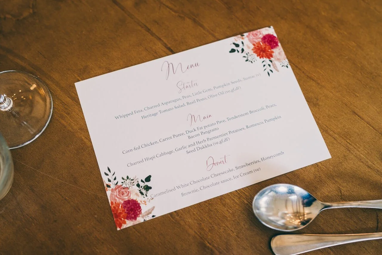
For the stationery, I reflected this warmth through hand-illustrated florals featuring dahlias, garden roses, feathery foliage and deep, velvety blooms — all in those same earthy, jewel-toned hues. The blush base kept everything feeling soft and romantic rather than heavy, while the deep burgundy script lettering tied each piece together and echoed the richness of the flowers throughout the venue.

How the Stationery Suite Came Together
One of the things I love most about working on a fully cohesive suite is watching how each individual piece builds on the last. When every element — from the welcome sign right through to the individual table cards — shares the same floral motif, the same colour palette and the same typographic voice, the overall effect is something really special.
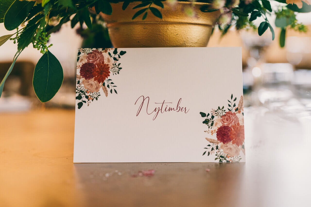
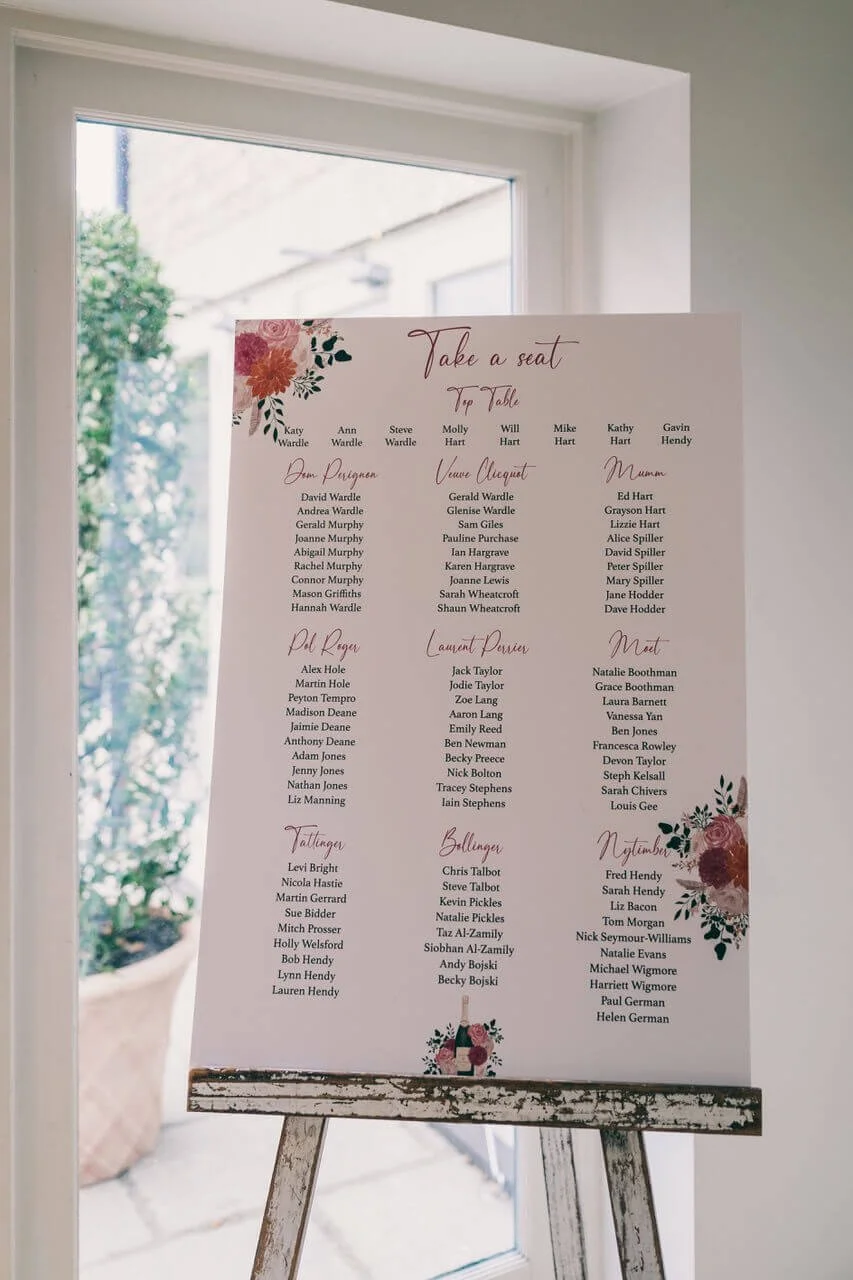
For this wedding, the couple chose to name their tables after champagne houses — Dom Pérignon, Veuve Clicquot, Mumm, Pol Roger, Laurent Perrier, Moët, Tattinger, Bollinger, Nyetimber — which gave the stationery such a wonderful opportunity to shine. Each table card carried the same signature florals from the wider suite, so that no matter where a guest was seated, everything felt intentional and beautifully considered.
The seating plan, displayed on a rustic easel in a gorgeous light-filled space, listed every table in the same warmly-toned script — topped with the suite's signature autumnal blooms. It made such a striking first impression as guests arrived into the reception. That moment when someone walks in and sees a beautifully designed seating plan is one of my favourite things about wedding stationery. It signals immediately that care has been taken over every detail.

The Welcome Sign: Your Guests' First Impression
The welcome sign is always one of the pieces I get most excited about, because it's the very first thing your guests see on the day. It sets the entire tone before a single word is spoken or a glass is raised.
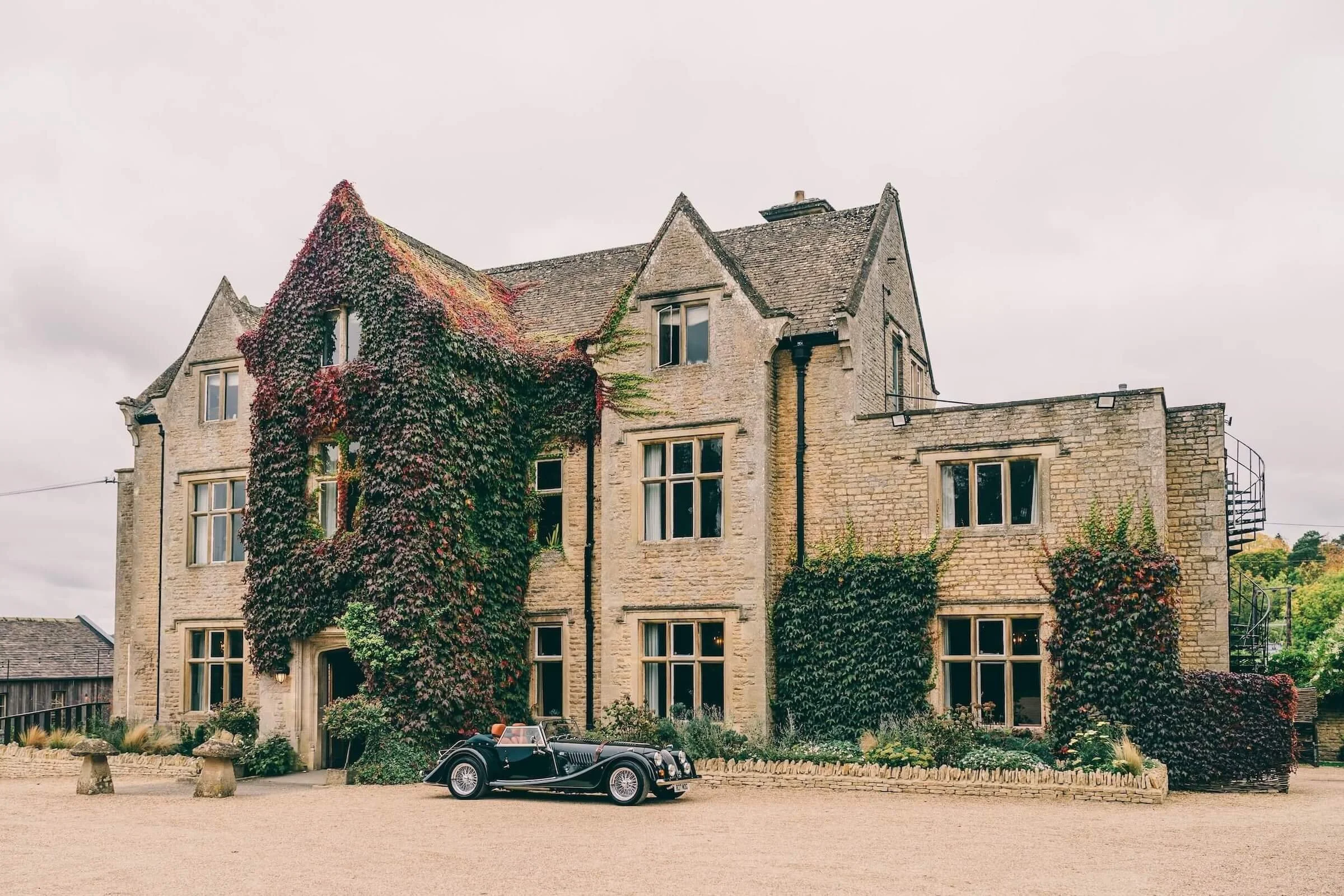
Here, the sign featured a hand-illustrated sketch of the Hyde House alongside the signature floral corners, all on that soft blush background with the deep berry script. Standing on a rustic wooden easel outside the venue entrance, it looked like it had always belonged there — completely at home within the warmth of an October afternoon.


The Case for Autumnal Wedding Stationery
Looking at the photographs from this wedding — that extraordinary floral arch, with its towering columns of lime green hydrangea, deep berry dahlias, soft peach roses and burnished orange foliage — I'm reminded again of just how extraordinary this season is for weddings. There is simply nothing like it.
And the stationery, when it's designed to genuinely reflect those colours and that feeling, becomes part of that magic. It's not just functional. It tells your guests, before they've even arrived, exactly what kind of day this is going to be.


Could an Autumnal Suite Work for You?
It doesn't have to be an October wedding for this palette to feel right. If you're drawn to warmth, romance and rich floral hues, this kind of design translates beautifully across late summer through to winter celebrations. Berry tones are incredible in the evening candlelight of a November wedding. Blush and dusty rose feel completely fresh in a late August barn setting. And if you're planning a December wedding? Deep burgundy, copper and forest green with a blush base is one of the most quietly stunning combinations I've ever worked with.
Whether you're hosting fifty guests or five hundred, whether your venue is a Cotswold manor or a converted barn, this kind of stationery suite is entirely customisable to your setting, your story and your style. The colours, the wording, the finishing touches — from wax seals to envelope liners — all of it shaped around you.
If this has sparked something for you, I'd love to chat about bringing your vision to life. Drop me a message on Instagram or get in touch via my contact form — I can't wait to hear about your day.
Photographer - https://robtarren.co.uk
Venue - www.hydehouse.co.uk
